2 Spatial data and R packages for mapping
In this chapter we describe the basic characteristics and provide examples of spatial data including areal, geostatistical and point patterns. Then we introduce the geopraphic and projected coordinate reference systems (CRS) that are used for spatial data representation, and show how to use R to set CRS and transform data to different projections. Then we describe the data storage format called shapefile to store geospatial data. Finally, we present several examples that show R packages useful to create static and interactive maps including ggplot2 (Wickham, Chang, et al. 2023), leaflet (Cheng et al. 2023), mapview (Appelhans et al. 2022) and tmap (Tennekes 2022). Examples show how to define color palettes, create legends, use background maps, plot different geometries, and save maps as HTML files or as static images.
2.1 Types of spatial data
A spatial process in \(d=2\) dimensions is denoted as
\[\{ Z(\boldsymbol{s}): \boldsymbol{s} \in D \subset \mathbb{R}^d\}.\]
Here, \(Z\) denotes the attribute we observe, for example, the number of sudden infant deaths or the level of rainfall, and \(\boldsymbol{s}\) refers to the location of the observation. Cressie (1993) distinguishes three basic types of spatial data through characteristics of the domain \(D\), namely, areal data, geostatistical data, and point patterns.
2.1.1 Areal data
In areal (or lattice) data the domain \(D\) is fixed (of regular or irregular shape) and partitioned into a finite number of areal units with well-defined boundaries. Examples of areal data are attributes collected by ZIP code, census tract, or remotely sensed data reported by pixels.
An example of areal data is shown in Figure 2.1 which depicts the number of sudden infant deaths in each of the counties of North Carolina, USA, in 1974 (Pebesma 2023). Here the region of interest (North Carolina) has been partitioned into a finite number of subregions (counties) at which outcomes have been aggregated. Using data about population and other covariates, we could obtain death risk estimates within each county. Other examples of areal data are presented in Moraga and Lawson (2012) where Bayesian hierarchical models are used to estimate the relative risk of low birth weight in Georgia, USA, in 2000, and Moraga and Kulldorff (2016) where spatial variations in temporal trends are assessed to detect unusual cervical cancer trends in white women in the USA over the period from 1969 to 1995.
library(sf)
library(ggplot2)
library(viridis)
nc <- st_read(system.file("shape/nc.shp", package = "sf"),
  quiet = TRUE
)
ggplot(data = nc, aes(fill = SID74)) + geom_sf() +
  scale_fill_viridis() + theme_bw()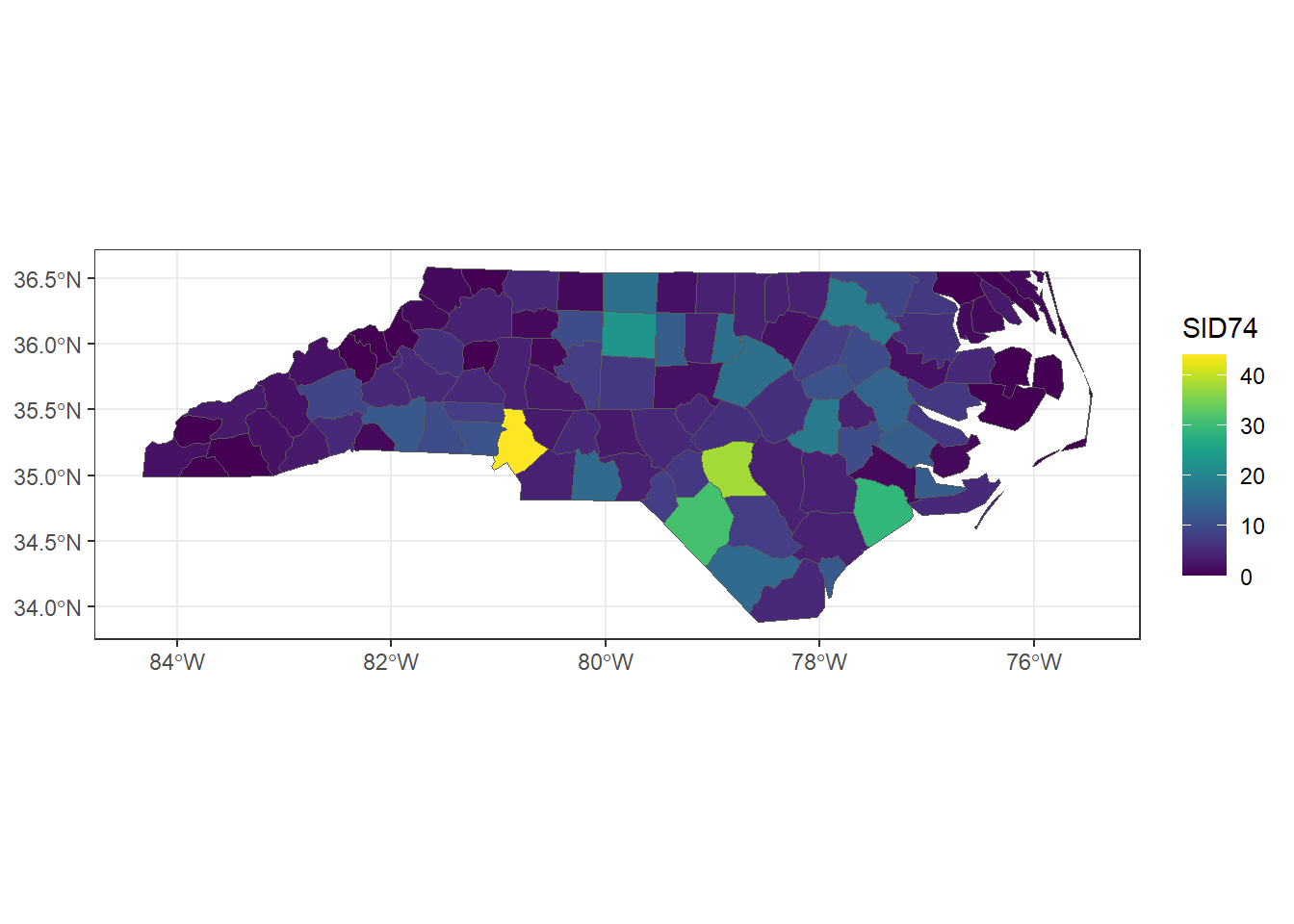
FIGURE 2.1: Sudden infant deaths in North Carolina in 1974.
2.1.2 Geostatistical data
In geostatistical data the domain \(D\) is a continuous fixed set. By continuous we mean that \(\boldsymbol{s}\) varies continuously over \(D\) and therefore \(Z(\boldsymbol{s})\) can be observed everywhere within \(D\). By fixed we mean that the points in \(D\) are non-stochastic. It is important to note that the continuity only refers to the domain, and the attribute \(Z\) can be continuous or discrete. Examples of this type of data are air pollution or rainfall values measured at several monitoring stations.
Figure 2.2 shows the average rainfall for the period May-June (dry season) over different years collected at 143 recording stations throughout Paraná state, Brazil (Ribeiro Jr et al. 2022). These data represent rainfall measurements obtained at specific stations and using model-based geostatistics we could predict rainfall at unsampled sites. Another example of geostatistical data is shown in Moraga et al. (2015). Here prevalence values of lymphatic filariasis are obtained from surveys conducted at several villages in sub-Saharan Africa. Authors use a geostatistical model to predict the disease risk at unobserved locations and construct a spatially continuous risk surface.
library(geoR)
ggplot(data.frame(cbind(parana$coords, Rainfall = parana$data)))+
  geom_point(aes(east, north, color = Rainfall), size = 2) +
  coord_fixed(ratio = 1) +
  scale_color_gradient(low = "blue", high = "orange") +
  geom_path(data = data.frame(parana$border), aes(east, north)) +
  theme_bw()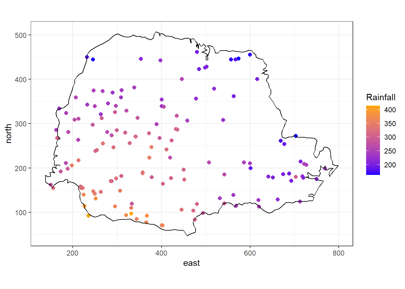
FIGURE 2.2: Average rainfall measured at 143 recording stations in Paraná state, Brazil.
2.1.3 Point patterns
Unlike geostatistical and lattice data, the domain \(D\) in point patterns is random. Its index set gives the locations of random events that are the spatial point pattern. \(Z(\boldsymbol{s})\) may be equal to 1 \(\forall \boldsymbol{s} \in D\), indicating occurrence of the event, or random, giving some additional information. An example of point pattern is the geographical coordinates of individuals with a given disease living in a city.
The locations of deaths of the 1854 London cholera outbreak represent a point pattern (Li 2019) (Figure 2.3). We could analyze these data using point process methods to understand the spatial distribution of deaths, and assess whether there is an excess of risk close to the pump in Broad street. Another example of point pattern is given in Moraga and Montes (2011) where authors develop a method to detect spatial clusters using point process data based on local indicators of spatial association functions, and apply it to detect clusters of kidney disease in the city of Valencia, Spain.
library(cholera)
rng <- mapRange()
plot(fatalities[, c("x", "y")],
  pch = 15, col = "black",
  cex = 0.5, xlim = rng$x, ylim = rng$y, asp = 1,
  frame.plot = FALSE, axes = FALSE, xlab = "", ylab = ""
)
addRoads()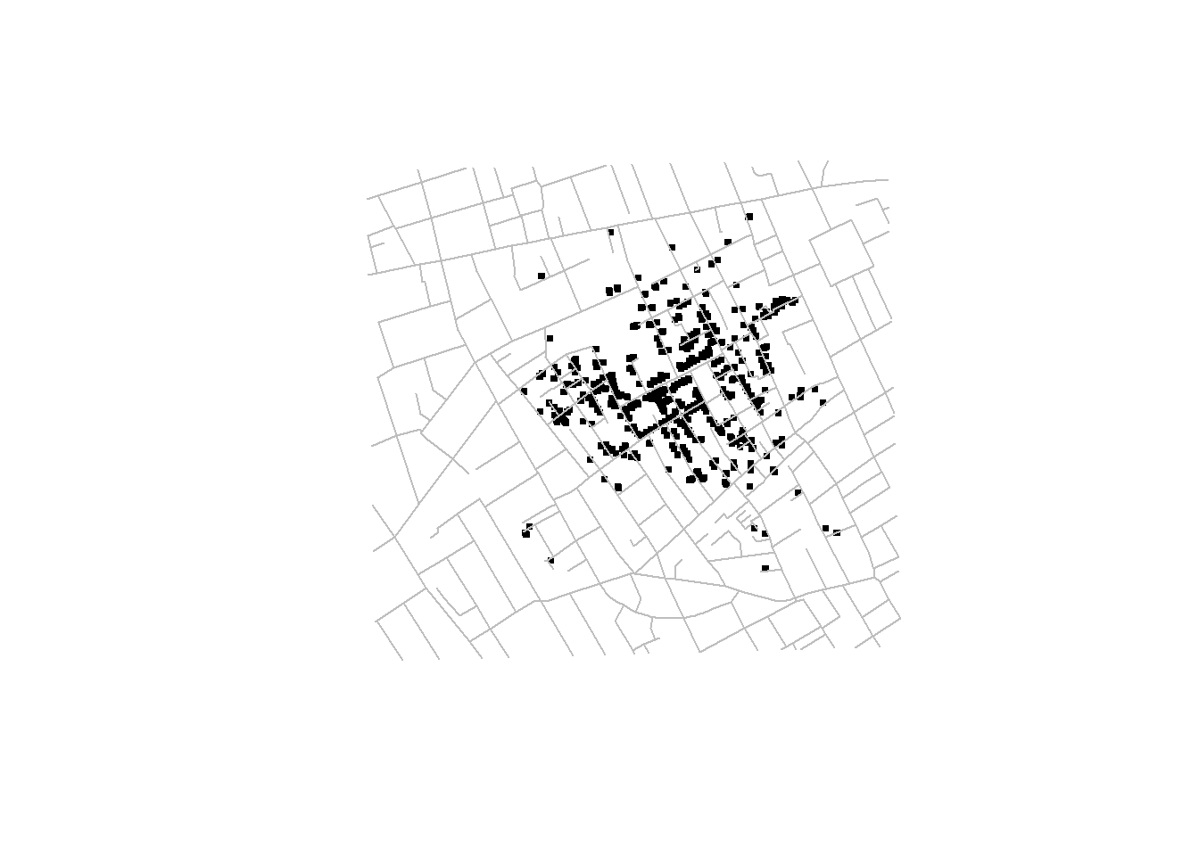
FIGURE 2.3: John Snow’s map of the 1854 London cholera outbreak.
2.2 Coordinate reference systems
An important aspect of spatial data is the coordinate reference system (CRS) that is used for representation. A CRS permits us to know the origin and the unit of measurement of the coordinates. Moreover, in the case of dealing with multiple data, knowledge of CRS permits to transform all data to a common CRS. Locations on the Earth can be referenced using geographic (also called unprojected) or projected coordinate reference systems (Figure 2.4):
- Unprojected or geographic reference systems use longitude and latitude for referencing a location on the Earth’s three-dimensional ellipsoid surface.
- Projected coordinate reference systems use easting and northing Cartesian coordinates for referencing a location on a two-dimensional representation of the Earth.
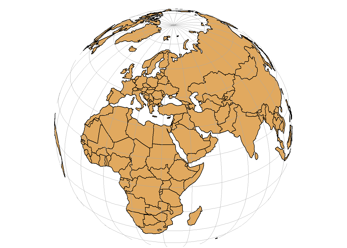
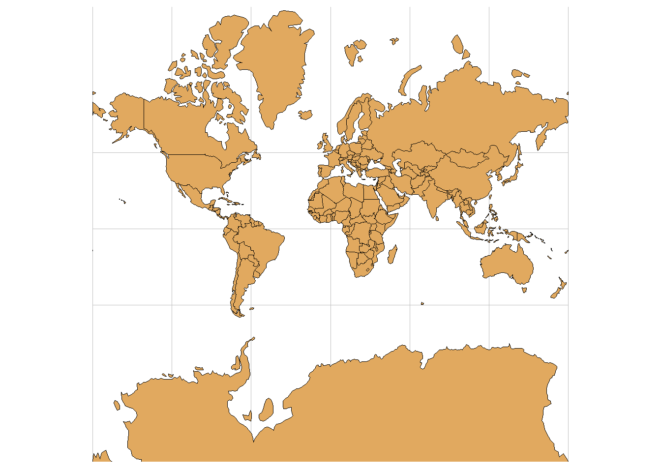
FIGURE 2.4: Three-dimensional surface of the Earth (left), and two-dimensional representation of the Earth (right).
2.2.1 Geographic coordinate systems
A geographic coordinate system specifies locations on the Earth’s three-dimensional surface using latitude and longitude values. Latitude and longitude are angles given in decimal degrees (DD) or in degrees, minutes, and seconds (DMS). The equator is an imaginary circle equidistant from the poles of the Earth that divides the Earth into northern and southern hemispheres. Horizontal lines parallel to the equator (running east and west) are lines of equal latitude or parallels. Vertical lines drawn from the north pole to the south pole are lines of equal longitude or meridians. The prime meridian passes through the British Royal Observatory in Greenwich, England, and determines the eastern and western hemispheres (Figure 2.5).
The latitude of a point on Earth’s surface is the angle between the equatorial plane and the line that passes through that point and the center of the Earth. Latitude values are measured relative to the equator (0 degrees) and range from -90 degrees at the south pole to 90 degrees at the north pole. The longitude of a point on the Earth’s surface is the angle west or east of the prime meridian to another meridian that passes through that point. Longitude values range from -180 degrees when running west to 180 degrees when running east.
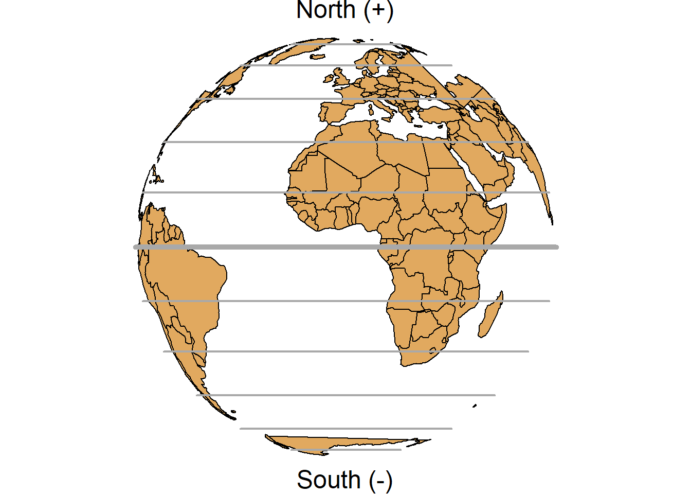
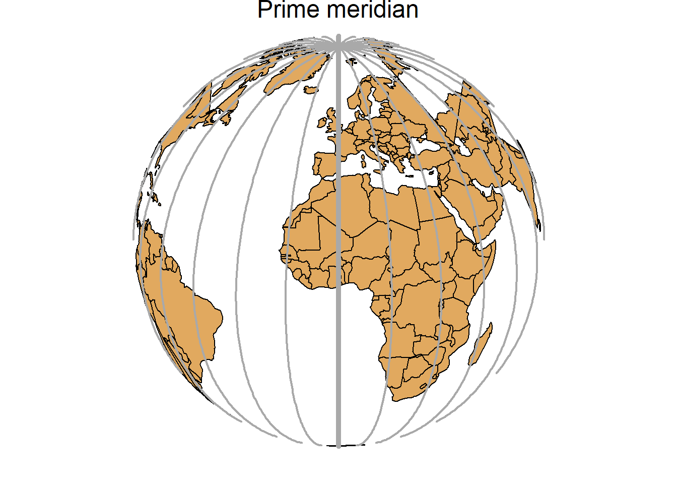
FIGURE 2.5: Parallels (left) and meridians (right) of the Earth.
2.2.2 Projected coordinate systems
A map projection is a transformation of the Earth’s three-dimensional surface as a flat two-dimensional plane. All map projections distort the Earth’s surface in some fashion and cannot simultaneously preserve all area, direction, shape and distance properties.
A common projection is the Universal Transverse Mercator (UTM) which preserves local angles and shapes. The UTM system divides the Earth into 60 zones of 6 degrees of longitude in width. Each of the zones uses a transverse Mercator projection that maps a region of large north-south extent.
A position on the Earth is given by the UTM zone number, the hemisphere (north or south), and the easting and northing coordinates in the zone which are measured in meters. Eastings are referenced from the central meridian of each zone, and northings are referenced from the equator. The easting at the central meridian of each zone is defined to have a value of 500,000 meters. This is an arbitrary value convenient for avoiding negative easting coordinates. In the northern hemisphere, the northing at the equator is defined to have a value of 0 meters. In the southern hemisphere, the equator has a northing value of 10,000,000 meters. This avoids negative northing coordinates in the southern hemisphere. Further details about this projection can be seen in Wikipedia.
2.2.3 Setting Coordinate Reference Systems in R
The Earth’s shape can be approximated by an oblate ellipsoid model that bulges at the equator and is flattened at the poles. There are different reference ellipsoids in use, and the most common one is the World Geodetic System (WGS84) which is used for example by the Global Positioning System (GPS). Datums are based on specific ellipsoids and define the position of the ellipsoid relative to the center of the Earth. Thus, while the ellipsoid approximates the Earth’s shape, the datum provides the origin point and defines the direction of the coordinate axes.
A CRS specifies how coordinates are related to locations on the Earth. In R, CRS are specified using proj4 strings that specify attributes such as the projection, the ellipsoid and the datum. For example, the WGS84 longitude/latitude projection is specified as
"+proj=longlat +ellps=WGS84 +datum=WGS84 +no_defs"The proj4 string of the UTM zone 29 is given by
"+proj=utm +zone=29 +ellps=WGS84 +datum=WGS84 +units=m +no_defs"and the UTM zone 29 in the south is defined as
"+proj=utm +zone=29 +ellps=WGS84 +datum=WGS84 +units=m +no_defs
+south"
Most common CRS can also be specified by providing the EPSG (European Petroleum Survey Group) code.
For example, the EPSG code of the WGS84 projection is 4326.
All the available CRS in R can be seen by typing View(rgdal::make_EPSG()).
This returns a data frame with the EPSG code, notes, and the proj4 attributes for each of the projections.
Details of a particular EPSG code, say 4326, can be seen by typing
CRS("+init=epsg:4326") which returns
+init=epsg:4326 +proj=longlat +ellps=WGS84 +datum=WGS84 +no_defs +towgs84=0,0,0.
We can find the codes of other commonly used projections on http://www.spatialreference.org.
Setting a projection may be necessary when the data do not contain information about the CRS.
This can be done by assigning CRS(projection) to the data, where projection is the string of projection arguments.
proj4string(d) <- CRS(projection)In addition, we may wish to transform data d to data with a different projection.
To do that, we can use the spTransform() function of the rgdal package (Bivand, Keitt, and Rowlingson 2023) or the st_transform() function of the sf package (Pebesma 2023).
An example on how to create a spatial dataset with coordinates given by longitude/latitude, and transform it to a dataset with coordinates in UTM zone 35 in the south using rgdal is given below.
library(rgdal)

# create data with coordinates given by longitude and latitude
d <- data.frame(long = rnorm(100, 0, 1), lat = rnorm(100, 0, 1))
coordinates(d) <- c("long", "lat")

# assign CRS WGS84 longitude/latitude
proj4string(d) <- CRS("+proj=longlat +ellps=WGS84
                      +datum=WGS84 +no_defs")

# reproject data from longitude/latitude to UTM zone 35 south
d_new <- spTransform(d, CRS("+proj=utm +zone=35 +ellps=WGS84
                      +datum=WGS84 +units=m +no_defs +south"))

# add columns UTMx and UTMy
d_new$UTMx <- coordinates(d_new)[, 1]
d_new$UTMy <- coordinates(d_new)[, 2]
2.3 Shapefiles
Geographic data can be represented using a data storage format called shapefile that stores the location, shape, and attributes of geographic features such as points, lines and polygons.
A shapefile is not a unique file,
but consists of a collection of related files that have different extensions and a common name and are stored in the same directory.
A shapefile has three mandatory files with extensions .shp, .shx, and .dbf:
-
.shp: contains the geometry data, -
.shx: is a positional index of the geometry data that allows to seek forwards and backwards the.shpfile, -
.dbf: stores the attributes for each shape.
Other files that can form a shapefile are the following:
-
.prj: plain text file describing the projection, -
.sbnand.sbx: spatial index of the geometry data, -
.shp.xml: geospatial metadata in XML format.
Thus, when working with shapefiles, it is not enough to obtain the .shp file that contains the geometry data,
all the other supporting files are also required.
In R, we can read shapefiles using the readOGR() function of the rgdal package,
or also the function st_read() of the sf package.
For example, we can read the shapefile of North Carolina which is stored in the sf package with readOGR() as follows:
# name of the shapefile of North Carolina of the sf package
nameshp <- system.file("shape/nc.shp", package = "sf")## [1] "SpatialPolygonsDataFrame"
## attr(,"package")
## [1] "sp"
head(map@data)## AREA PERIMETER CNTY_ CNTY_ID NAME FIPS
## 0 0.114 1.442 1825 1825 Ashe 37009
## 1 0.061 1.231 1827 1827 Alleghany 37005
## 2 0.143 1.630 1828 1828 Surry 37171
## 3 0.070 2.968 1831 1831 Currituck 37053
## 4 0.153 2.206 1832 1832 Northampton 37131
## 5 0.097 1.670 1833 1833 Hertford 37091
## FIPSNO CRESS_ID BIR74 SID74 NWBIR74 BIR79 SID79
## 0 37009 5 1091 1 10 1364 0
## 1 37005 3 487 0 10 542 3
## 2 37171 86 3188 5 208 3616 6
## 3 37053 27 508 1 123 830 2
## 4 37131 66 1421 9 1066 1606 3
## 5 37091 46 1452 7 954 1838 5
## NWBIR79
## 0 19
## 1 12
## 2 260
## 3 145
## 4 1197
## 5 1237A map of North Carolina imported with the rgdal package can be produced as follows (Figure 2.6):
plot(map)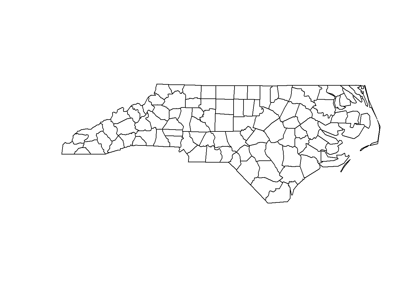
FIGURE 2.6: Map of North Carolina imported with the rgdal package.
We can also read the map with st_read() as follows:
## [1] "sf" "data.frame"
head(map)## Simple feature collection with 6 features and 14 fields
## Geometry type: MULTIPOLYGON
## Dimension: XY
## Bounding box: xmin: -81.74 ymin: 36.07 xmax: -75.77 ymax: 36.59
## Geodetic CRS: NAD27
## AREA PERIMETER CNTY_ CNTY_ID NAME FIPS
## 1 0.114 1.442 1825 1825 Ashe 37009
## 2 0.061 1.231 1827 1827 Alleghany 37005
## 3 0.143 1.630 1828 1828 Surry 37171
## 4 0.070 2.968 1831 1831 Currituck 37053
## 5 0.153 2.206 1832 1832 Northampton 37131
## 6 0.097 1.670 1833 1833 Hertford 37091
## FIPSNO CRESS_ID BIR74 SID74 NWBIR74 BIR79 SID79
## 1 37009 5 1091 1 10 1364 0
## 2 37005 3 487 0 10 542 3
## 3 37171 86 3188 5 208 3616 6
## 4 37053 27 508 1 123 830 2
## 5 37131 66 1421 9 1066 1606 3
## 6 37091 46 1452 7 954 1838 5
## NWBIR79 geometry
## 1 19 MULTIPOLYGON (((-81.47 36.2...
## 2 12 MULTIPOLYGON (((-81.24 36.3...
## 3 260 MULTIPOLYGON (((-80.46 36.2...
## 4 145 MULTIPOLYGON (((-76.01 36.3...
## 5 1197 MULTIPOLYGON (((-77.22 36.2...
## 6 1237 MULTIPOLYGON (((-76.75 36.2...A map of North Carolina imported with the sf package can be produced as follows (Figure 2.7):
plot(map)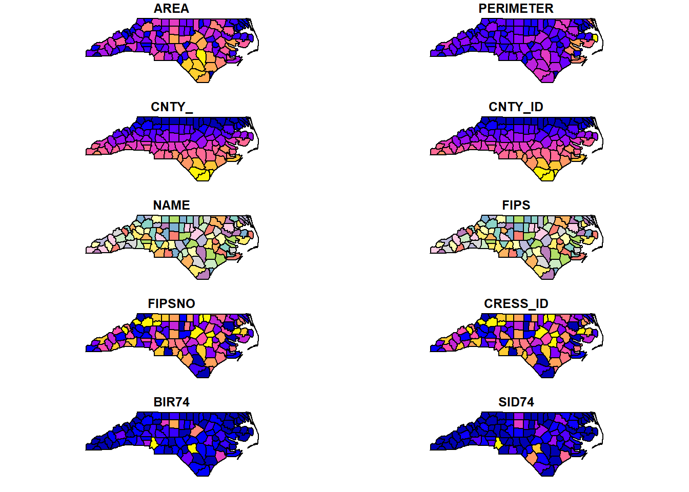
FIGURE 2.7: Map of North Carolina imported with the sf package.
2.4 Making maps with R
Maps are very useful to convey geospatial information. Here, we present simple examples that demonstrate the use of some of the packages that are commonly used for mapping in R, namely, ggplot2, leaflet, mapview, and tmap. In the rest of the book, we show how to create more complex maps to visualize the results of several applications using the ggplot2 and leaflet packages.
2.4.1 ggplot2
ggplot2 (https://ggplot2.tidyverse.org/) is a package to create graphics based on the grammar of graphics. This means we can create a plot using the ggplot() function and the following elements:
- Data we want to visualize.
- Geometric shapes that represent the data such as points or bars. Shapes are specified with
geom_*()functions. For example,geom_point()is used for points andgeom_histogram()is used for histograms. - Aesthetics of the geometric objects.
aes()is used to map variables in the data to the visual properties of the objects such as color, size, shape, and position. - Optional elements such as scales, titles, labels, legends, and themes.
We can create maps by using the geom_sf() function and providing a simple feature (sf) object.
Note that if the data available is a spatial object of class SpatialPolygonsDataFrame, we can easily convert it to a simple feature object of class sf with the st_as_sf() function of the sf package.
For example, we can create a map of sudden infant deaths in North Carolina in 1974 (SID74) as follows
(Figure 2.8):
library(sf)
library(ggplot2)
nameshp <- system.file("shape/nc.shp", package = "sf")
map <- st_read(nameshp, quiet = TRUE)
ggplot(map) + geom_sf(aes(fill = SID74)) + theme_bw()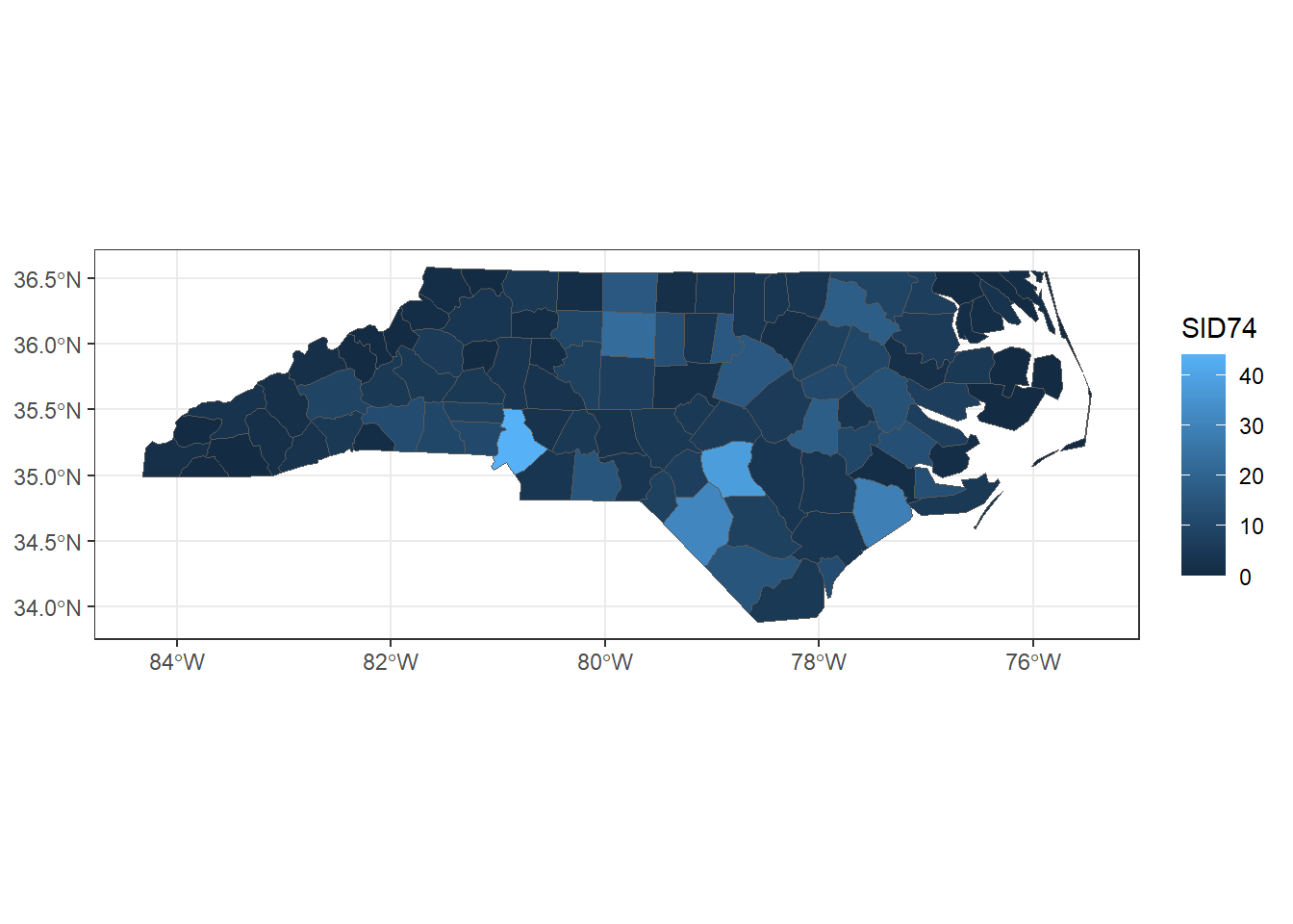
FIGURE 2.8: Map of sudden infant deaths in North Carolina in 1974, created with ggplot2.
In ggplot() the default color scale for discrete variables is scale_*_hue().
Here * indicates color (to color features such as points and lines) or fill (to color polygons or histograms).
We can change the default scale by using
scale_*_grey() which uses grey colors,
scale_*_brewer() which uses colors of the RColorBrewer package (Neuwirth 2022), and
scale_*_viridis(discrete = TRUE) which uses colors of the viridis package (Garnier 2023).
We can also manually define our own set of colors with scale_*_manual().
Note that this function has a logical argument called drop to decide whether to keep unusued factor levels in the scale.
Color scales for continuous variables can be specified with
scale_*_gradient() which creates a sequential gradient between two colors (low-high),
scale_*_gradient2() which creates a diverging color gradient (low-mid-high), and
scale_*_gradientn() which creates a gradient between n colors.
We can also use scale_*_distiller() and scale_*_viridis() to use colors of the packages RColorBrewer and viridis, respectively.
We can plot the map of SID74 with the viridis scale as follows
(Figure 2.9):
library(viridis)
map <- st_as_sf(map)
ggplot(map) + geom_sf(aes(fill = SID74)) +
  scale_fill_viridis() + theme_bw()
FIGURE 2.9: Map of sudden infant deaths in North Carolina in 1974, created with ggplot2 and viridis scale.
To save a plot produced with ggplot2, we can use the ggsave() function.
Alternatively, we can save the plot by specifying a device driver (e.g., png, pdf), printing the plot, and then shutting down the device with dev.off():
png("plot.png")
ggplot(map) + geom_sf(aes(fill = SID74)) +
  scale_fill_viridis() + theme_bw()
dev.off()
Moreover, packages gganimate (Pedersen and Robinson 2022) and plotly (Sievert et al. 2023) can be used in combination with ggplot2 to create animated and interactive plots, respectively.
2.4.2 leaflet
Leaflet is a very popular open-source JavaScript library for interactive maps.
The R package leaflet (https://rstudio.github.io/leaflet/) makes it easy to integrate and control Leaflet maps in R.
We can create a map using leaflet by calling the leaflet() function, and then adding layers to the map by using layer functions.
For example, we can use addTiles() to add a background map, addPolygons() to add polygons, and addLegend() to add a legend.
We can use a variety of background maps. Examples can be seen in the leaflet providers’ website.
A map of SID74 with a color scale given by the palette "YlOrRd" of the RColorBrewer package can be created as follows.
First, we transform map which has projection given by EPSG code 4267 to projection with EPSG code 4326 which is the projection required by leaflet. We do this by using the st_transform() function of the sf package.
st_crs(map)## Coordinate Reference System:
## User input: NAD27
## wkt:
## GEOGCRS["NAD27",
## DATUM["North American Datum 1927",
## ELLIPSOID["Clarke 1866",6378206.4,294.978698213898,
## LENGTHUNIT["metre",1]]],
## PRIMEM["Greenwich",0,
## ANGLEUNIT["degree",0.0174532925199433]],
## CS[ellipsoidal,2],
## AXIS["latitude",north,
## ORDER[1],
## ANGLEUNIT["degree",0.0174532925199433]],
## AXIS["longitude",east,
## ORDER[2],
## ANGLEUNIT["degree",0.0174532925199433]],
## ID["EPSG",4267]]
map <- st_transform(map, 4326)Then we create a color palette using colorNumeric(), and plot the map using the leaflet(), addTiles(), and addPolygons() functions specifying the color of the polygons’ border (color) and the polygons (fillColor), the opacity (fillOpacity), and the legend (Figure 2.10).
library(leaflet)

pal <- colorNumeric("YlOrRd", domain = map$SID74)

leaflet(map) %>%
  addTiles() %>%
  addPolygons(
    color = "white", fillColor = ~ pal(SID74),
    fillOpacity = 1
  ) %>%
  addLegend(pal = pal, values = ~SID74, opacity = 1)
FIGURE 2.10: Map of sudden infant deaths in North Carolina in 1974, created with leaflet.
To save the map created to an HTML file, we can use the saveWidget() function of the htmlwidgets package (Vaidyanathan et al. 2023).
If we wish to save an image of the map, we first save it as an HTML file with saveWidget() and then capture a static version of the HTML using the webshot() function of the webshot package (Chang 2023).
2.4.3 mapview
The mapview package (https://r-spatial.github.io/mapview/) allows to very quickly create interactive visualizations to investigate both the spatial geometries and the variables in the data.
For example, we can create a map showing SID74 by just using the mapview() function
with arguments the map object and the variable we want to show (zcol = "SID74") (Figure ??).
This map is interactive and by clicking in each of the counties we can see popups with the information of the other variables in the data.
mapview is very convenient to very quickly inspect spatial data, but maps created can also be customized by adding elements such as legends and background maps.
Moreover, we can create visualizations that show multiple layers and incorporate synchronization.
For example, we can create a map
with background map "CartoDB.DarkMatter" and color from the palette "YlOrRd" of the RColorBrewer package as follows:
library(RColorBrewer)
pal <- colorRampPalette(brewer.pal(9, "YlOrRd"))
mapview(map,
  zcol = "SID74",
  map.types = "CartoDB.DarkMatter",
  col.regions = pal
)
We can also use the sync() function to produce a lattice-like view of multiple synchronized maps created with mapview or leaflet. For example, we can create maps of sudden infant deaths in 1974 and 1979
with synchronized zoom and pan by
first creating maps of the variables SID74 and SID79
with mapview(), and then passing those maps as arguments of the sync() function of the leafsync package
(Figure 2.11).
library(leafsync)
m74 <- mapview(map, zcol = "SID74")
m79 <- mapview(map, zcol = "SID79")
m <- leafsync::sync(m74, m79)
m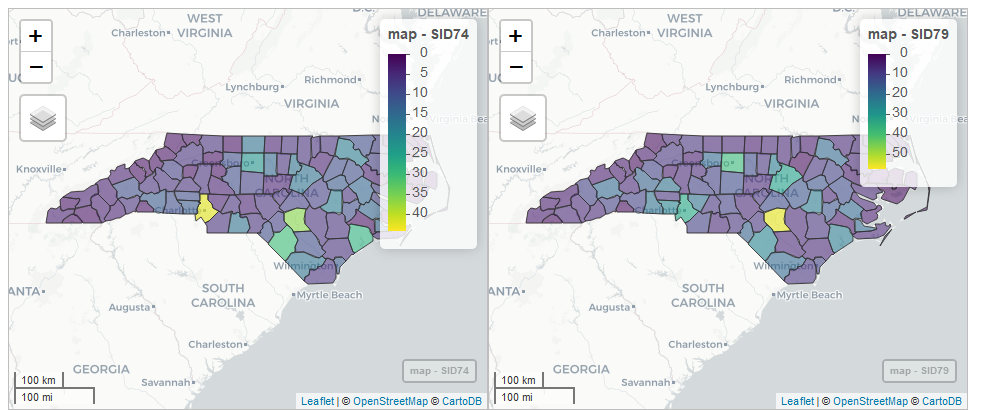
FIGURE 2.11: Snapshot of synchronized maps of sudden infant deaths in North Carolina in 1974 and 1979.
We can save maps created with mapview in the same manner as maps created with leaflet (using saveWidget() and webshot()).
Alternatively, maps can be saved with the mapshot() function
as an HTML file or as a PNG, PDF, or JPEG image.
2.4.4 tmap
The tmap package is used to generate thematic maps with great flexibility.
Maps are created by using the tm_shape() function and adding layers with a tm_*() function.
In addition, we can create static or interactive maps by setting tmap_mode("plot") and tmap_mode("view"), respectively.
For example, an interactive map of SID74 can be created as follows:
library(tmap)
tmap_mode("view")
tm_shape(map) + tm_polygons("SID74")
This package also allows to create visualizations with multiple shapes and layers, and specify different styles.
To save maps created with tmap, we can use the tmap_save() function where we need to specify the name of the HTML file (view mode) or image (plot mode). Additional information about tmap can be seen in the package vignette.