7 Spatio-temporal modeling of areal data. Lung cancer in Ohio
In this chapter we estimate the risk of lung cancer in Ohio, USA, from 1968 to 1988 using the R-INLA package (Havard Rue, Lindgren, and Teixeira Krainski 2023). The lung cancer data and the Ohio map are obtained from the SpatialEpiApp package (Moraga 2018b). First, we show how to calculate the expected disease counts using indirect standardization, and the standardized incidence ratios (SIRs). Then we fit a Bayesian spatio-temporal model to obtain disease risk estimates for each of the Ohio counties and years of study. We also show how to create static and interactive maps and time plots of the SIRs and disease risk estimates using the ggplot2 (Wickham, Chang, et al. 2023) and plotly (Sievert et al. 2023) packages, and how to generate animated maps showing disease risk for each year with the gganimate package (Pedersen and Robinson 2022).
7.1 Data and map
The lung cancer data and the Ohio map that we use in this chapter can be obtained from the SpatialEpiApp package.
The file dataohiocomplete.csv that is in folder SpatialEpiApp/data/Ohio of the package
contains the lung cancer cases and population stratified by gender and race in each of the Ohio counties from 1968 to 1988.
We can find the full name of file dataohiocomplete.csv in the SpatialEpiApp package by using the system.file() function.
Then we can read the data using the read.csv() function.
library(SpatialEpiApp)
namecsv <- "SpatialEpiApp/data/Ohio/dataohiocomplete.csv"
dohio <- read.csv(system.file(namecsv, package = "SpatialEpiApp"))
head(dohio)
## county gender race year y n NAME
## 1 1 1 1 1968 6 8912 Adams
## 2 1 1 1 1969 5 9139 Adams
## 3 1 1 1 1970 8 9455 Adams
## 4 1 1 1 1971 5 9876 Adams
## 5 1 1 1 1972 8 10281 Adams
## 6 1 1 1 1973 5 10876 AdamsA shapefile with the Ohio counties is in folder SpatialEpiApp/data/Ohio/fe_2007_39_county of SpatialEpiApp.
We can read the shapefile with the function readOGR() of the rgdal package specifying the full path of the shapefile
(Figure 7.1).
library(rgdal)
library(sf)

nameshp <- system.file(
"SpatialEpiApp/data/Ohio/fe_2007_39_county/fe_2007_39_county.shp",
package = "SpatialEpiApp")
map <- readOGR(nameshp, verbose = FALSE)

plot(map)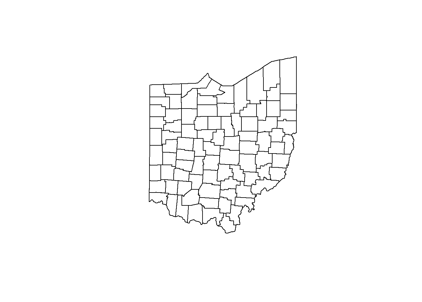
FIGURE 7.1: Map of Ohio counties.
7.2 Data preparation
The data contain the number of lung cancer cases and population stratified by gender and race in each of the Ohio counties from 1968 to 1988. Here, we calculate the observed and expected counts, and the SIRs for each county and year, and create a data frame with the following variables:
-
county: id of county, -
year: year, -
Y: observed number of cases in the county and year, -
E: expected number of cases in the county and year, -
SIR: SIR of the county and year.
7.2.1 Observed cases
We obtain the number of cases for all the strata together in each county and year by aggregating the data dohio by county and year and adding up the number of cases.
To do this, we use the aggregate() function specifying the vector of cases, the list of grouping elements as list(county = dohio$NAME, year = dohio$year), and the function to apply to the data subsets equal to sum. We also set the names of the returned data frame equal to county, year and Y.
d <- aggregate(
  x = dohio$y,
  by = list(county = dohio$NAME, year = dohio$year),
  FUN = sum
)
names(d) <- c("county", "year", "Y")
head(d)
## county year Y
## 1 Adams 1968 6
## 2 Allen 1968 32
## 3 Ashland 1968 15
## 4 Ashtabula 1968 27
## 5 Athens 1968 12
## 6 Auglaize 1968 77.2.2 Expected cases
Now we calculate the expected number of cases using indirected standardization with the expected() function of the SpatialEpi package.
The arguments of this function are the population and cases for each strata and year, and the number of strata.
The vectors of population and cases need to be sorted first by area and year, and then within each area and year, the counts for all strata need to be listed in the same order. If for some strata there are no cases, we still need to include them by writing 0 cases.
We sort the values of the data dohio as it is needed by the expected() function.
To do that, we use the order() function specifying that we want to sort by county, year, gender and then race.
dohio <- dohio[order(
  dohio$county,
  dohio$year,
  dohio$gender,
  dohio$race
), ]
We can inspect the first rows of the sorted data and check they are sorted as we wish.
dohio[1:20, ]## county gender race year y n NAME
## 1 1 1 1 1968 6 8912 Adams
## 22 1 1 2 1968 0 24 Adams
## 43 1 2 1 1968 0 8994 Adams
## 64 1 2 2 1968 0 22 Adams
## 2 1 1 1 1969 5 9139 Adams
## 23 1 1 2 1969 0 20 Adams
## 44 1 2 1 1969 0 9289 Adams
## 65 1 2 2 1969 0 24 Adams
## 3 1 1 1 1970 8 9455 Adams
## 24 1 1 2 1970 0 18 Adams
## 45 1 2 1 1970 1 9550 Adams
## 66 1 2 2 1970 0 24 Adams
## 4 1 1 1 1971 5 9876 Adams
## 25 1 1 2 1971 0 20 Adams
## 46 1 2 1 1971 1 9991 Adams
## 67 1 2 2 1971 0 27 Adams
## 5 1 1 1 1972 8 10281 Adams
## 26 1 1 2 1972 0 23 Adams
## 47 1 2 1 1972 2 10379 Adams
## 68 1 2 2 1972 0 31 AdamsNow we calculate the expected number of cases by using the expected() function
and specifying population = dohio$n and cases = dohio$y.
Data are stratified by 2 races and 2 genders, so the number of strata is 2 x 2 = 4.
library(SpatialEpi)
n.strata <- 4
E <- expected(
  population = dohio$n,
  cases = dohio$y,
  n.strata = n.strata
)
Now we create a data frame called dE with the expected counts for each county and year. Data frame dE has columns denoting counties (county), years (year), and expected counts (E).
The elements in E correspond to counties given by unique(dohio$NAME) and years given by unique(dohio$year).
Specifically, the counties of E are those obtained by repeating
each element of counties nyears times, where nyears is the number of years.
This can be computed with the rep() function using the argument each.
The years of E are those obtained by repeating the whole vector of
years ncounties times, where ncounties is the number of counties.
This can be computed with the rep() function using the argument times.
ncounties <- length(unique(dohio$NAME))
yearsE <- rep(unique(dohio$year),
              times = ncounties)

dE <- data.frame(county = countiesE, year = yearsE, E = E)

head(dE)
## county year E
## 1 Adams 1968 8.279
## 2 Adams 1969 8.502
## 3 Adams 1970 8.779
## 4 Adams 1971 9.175
## 5 Adams 1972 9.549
## 6 Adams 1973 10.100The data frame d that we constructed before contains the counties, years, and number of cases.
We add the expected counts to d by merging the data frames d and dE using the merge() function and merging by county and year.
##   county year  Y      E
## 1  Adams 1968  6  8.279
## 2  Adams 1969  5  8.502
## 3  Adams 1970  9  8.779
## 4  Adams 1971  6  9.175
## 5  Adams 1972 10  9.549
## 6  Adams 1973  7 10.100
7.2.3 SIRs
We calculate the SIR of county \(i\) and year \(j\) as \(\mbox{SIR}_{ij} = Y_{ij}/E_{ij}\), where \(Y_{ij}\) is the observed number of cases, and \(E_{ij}\) is the expected number of cases obtained based on the total population of Ohio during the period of study.
d$SIR <- d$Y / d$E
head(d)
## county year Y E SIR
## 1 Adams 1968 6 8.279 0.7248
## 2 Adams 1969 5 8.502 0.5881
## 3 Adams 1970 9 8.779 1.0251
## 4 Adams 1971 6 9.175 0.6539
## 5 Adams 1972 10 9.549 1.0473
## 6 Adams 1973 7 10.100 0.6931\(\mbox{SIR}_{ij}\) quantifies whether the county \(i\) and year \(j\) has higher (\(\mbox{SIR}_{ij} > 1\)), equal (\(\mbox{SIR}_{ij} = 1\)) or lower (\(\mbox{SIR}_{ij} < 1\)) occurrence of cases than expected.
7.2.4 Adding data to map
Now we add the data d that contain the lung cancer data to the map object. To do so, we need to transform the data d which is in long format to wide format.
Data d contain the variables county, year, Y, E and SIR.
We need to reshape the data to wide format, where the first column is county, and the rest of the columns denote the observed number of cases, the expected number of cases, and the SIRs separately for each of the years.
We can do this with the reshape() function passing the following arguments:
-
data: datad, -
timevar: name of the variable in the long format that corresponds to multiple variables in the wide format (year), -
idvar: name of the variable in the long format that identifies multiple records from the same group (county), -
direction: string equal to"wide"to reshape the data to wide format.
dw <- reshape(d,
  timevar = "year",
  idvar = "county",
  direction = "wide"
)

dw[1:2, ]
## county Y.1968 E.1968 SIR.1968 Y.1969 E.1969
## 1 Adams 6 8.279 0.7248 5 8.502
## 22 Allen 32 51.037 0.6270 33 50.956
## SIR.1969 Y.1970 E.1970 SIR.1970 Y.1971 E.1971
## 1 0.5881 9 8.779 1.0251 6 9.175
## 22 0.6476 39 50.901 0.7662 44 51.217
## SIR.1971 Y.1972 E.1972 SIR.1972 Y.1973 E.1973
## 1 0.6539 10 9.549 1.0473 7 10.10
## 22 0.8591 36 50.803 0.7086 38 50.65
## SIR.1973 Y.1974 E.1974 SIR.1974 Y.1975 E.1975
## 1 0.6931 12 10.41 1.1533 12 10.26
## 22 0.7502 41 50.80 0.8071 35 50.83
## SIR.1975 Y.1976 E.1976 SIR.1976 Y.1977 E.1977
## 1 1.1701 10 10.68 0.936 7 10.86
## 22 0.6886 54 50.31 1.073 63 50.64
## SIR.1977 Y.1978 E.1978 SIR.1978 Y.1979 E.1979
## 1 0.6445 13 11.02 1.1797 5 11.03
## 22 1.2442 42 50.34 0.8343 76 51.04
## SIR.1979 Y.1980 E.1980 SIR.1980 Y.1981 E.1981
## 1 0.4534 14 11.19 1.2510 12 11.34
## 22 1.4891 46 51.23 0.8979 53 51.20
## SIR.1981 Y.1982 E.1982 SIR.1982 Y.1983 E.1983
## 1 1.059 15 11.32 1.3256 9 11.20
## 22 1.035 47 50.34 0.9336 62 49.94
## SIR.1983 Y.1984 E.1984 SIR.1984 Y.1985 E.1985
## 1 0.8037 12 11.15 1.076 20 11.20
## 22 1.2416 69 50.39 1.369 53 50.56
## SIR.1985 Y.1986 E.1986 SIR.1986 Y.1987 E.1987
## 1 1.785 12 11.36 1.057 16 11.58
## 22 1.048 65 50.79 1.280 69 51.14
## SIR.1987 Y.1988 E.1988 SIR.1988
## 1 1.381 15 11.72 1.28
## 22 1.349 58 51.34 1.13Then, we merge the SpatialPolygonsDataFrame object map and the data frame in wide format dw by using the merge() function of the sp package.
We merge by column NAME in map and column county in dw.
map@data[1:2, ]## STATEFP COUNTYFP COUNTYNS CNTYIDFP NAME
## 0 39 011 <NA> 39011 Auglaize
## 1 39 033 <NA> 39033 Crawford
## NAMELSAD LSAD CLASSFP MTFCC UR FUNCSTAT
## 0 Auglaize County 06 H1 G4020 M A
## 1 Crawford County 06 H1 G4020 M A
map <- merge(map, dw, by.x = "NAME", by.y = "county")

map@data[1:2, ]
## NAME STATEFP COUNTYFP COUNTYNS CNTYIDFP
## 6 Auglaize 39 011 <NA> 39011
## 17 Crawford 39 033 <NA> 39033
## NAMELSAD LSAD CLASSFP MTFCC UR FUNCSTAT
## 6 Auglaize County 06 H1 G4020 M A
## 17 Crawford County 06 H1 G4020 M A
## Y.1968 E.1968 SIR.1968 Y.1969 E.1969 SIR.1969
## 6 7 17.26 0.4055 10 17.40 0.5748
## 17 14 22.13 0.6327 19 22.59 0.8411
## Y.1970 E.1970 SIR.1970 Y.1971 E.1971 SIR.1971
## 6 8 17.57 0.4554 16 17.89 0.8943
## 17 27 22.98 1.1749 13 23.58 0.5514
## Y.1972 E.1972 SIR.1972 Y.1973 E.1973 SIR.1973
## 6 6 18.05 0.3324 15 18.45 0.8128
## 17 18 23.46 0.7673 18 23.64 0.7615
## Y.1974 E.1974 SIR.1974 Y.1975 E.1975 SIR.1975
## 6 12 18.70 0.6416 12 19.42 0.6179
## 17 13 23.46 0.5542 24 23.31 1.0296
## Y.1976 E.1976 SIR.1976 Y.1977 E.1977 SIR.1977
## 6 20 18.89 1.058 18 18.99 0.948
## 17 25 23.31 1.073 17 23.16 0.734
## Y.1978 E.1978 SIR.1978 Y.1979 E.1979 SIR.1979
## 6 11 19.23 0.572 18 19.44 0.9261
## 17 30 23.40 1.282 23 23.10 0.9958
## Y.1980 E.1980 SIR.1980 Y.1981 E.1981 SIR.1981
## 6 17 19.44 0.8744 20 19.55 1.023
## 17 28 22.69 1.2343 21 22.70 0.925
## Y.1982 E.1982 SIR.1982 Y.1983 E.1983 SIR.1983
## 6 23 19.60 1.173 16 19.51 0.8203
## 17 37 22.47 1.647 21 22.11 0.9498
## Y.1984 E.1984 SIR.1984 Y.1985 E.1985 SIR.1985
## 6 35 19.78 1.769 22 19.88 1.107
## 17 26 22.39 1.161 35 22.37 1.564
## Y.1986 E.1986 SIR.1986 Y.1987 E.1987 SIR.1987
## 6 23 19.94 1.154 19 20.08 0.946
## 17 30 22.16 1.354 24 22.18 1.082
## Y.1988 E.1988 SIR.1988
## 6 22 20.20 1.089
## 17 31 22.13 1.4017.3 Mapping SIRs
The object map contains the SIRs of each of the Ohio counties and years.
We make maps of the SIRs using ggplot() and geom_sf().
First, we convert the object map of type SpatialPolygonsDataFrame to an object of type sf.
map_sf <- st_as_sf(map)We use the facet_wrap() function to make maps for each of the years and put them together in the same plot.
To use facet_wrap(), we need to transform the data to long format so it has
a column value with the variable we want to plot (SIR), and a column key that specifies the year.
We can transform the data from the wide to the long format with the function gather() of the tidyr package (Wickham, Vaughan, and Girlich 2023).
The arguments of gather() are the following:
-
data: data object, -
key: name of new key column, -
value: name of new value column, -
...: names of the columns with the values, -
factor_key: logical value that indicates whether to treat the new key column as a factor instead of character vector (default isFALSE).
Column year of map_sf contains the values SIR.1968, …, SIR.1988. We set these values equal to years 1968, …, 1988 using the substring() function. We also convert the values to integers using the as.integer() function.
map_sf$year <- as.integer(substring(map_sf$year, 5, 8))Now we map the SIRs with ggplot() and geom_sf(). We split the data by year and put the maps of each year together using facet_wrap().
We pass parameters to divide by year (~ year), go horizontally (dir = "h"), and wrap with 7 columns (ncol = 7).
Then, we write a title with ggtitle(), use the classic dark-on-light theme theme_bw(), and eliminate axes and ticks in the maps by specifying theme elements element_blank().
We decide to use scale_fill_gradient2() to fill counties with SIRs less than 1 with colors in the gradient blue-white,
and fill counties with SIRs greater than 1 with colors in the gradient white-red (Figure 7.2).
library(ggplot2)
ggplot(map_sf) + geom_sf(aes(fill = SIR)) +
  facet_wrap(~year, dir = "h", ncol = 7) +
  ggtitle("SIR") + theme_bw() +
  theme(
    axis.text.x = element_blank(),
    axis.text.y = element_blank(),
    axis.ticks = element_blank()
  ) +
  scale_fill_gradient2(
    midpoint = 1, low = "blue", mid = "white", high = "red"
  )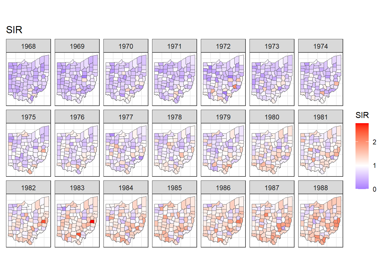
FIGURE 7.2: Maps of lung cancer SIR in Ohio counties from 1968 to 1988 created with a diverging color scale.
7.4 Time plots of SIRs
Now we plot the SIRs of each of the counties over time using the ggplot() function.
We use data d which has columns for county, year, Y, E and SIR.
In aes() we specify x-axis as year, y-axis as SIR, and grouping as county.
Inside aes(), we also put color = county to make color conditional on the variable county (Figure 7.3).
g <- ggplot(d, aes(x = year, y = SIR,
                   group = county, color = county)) +
  geom_line() + geom_point(size = 2) + theme_bw()
g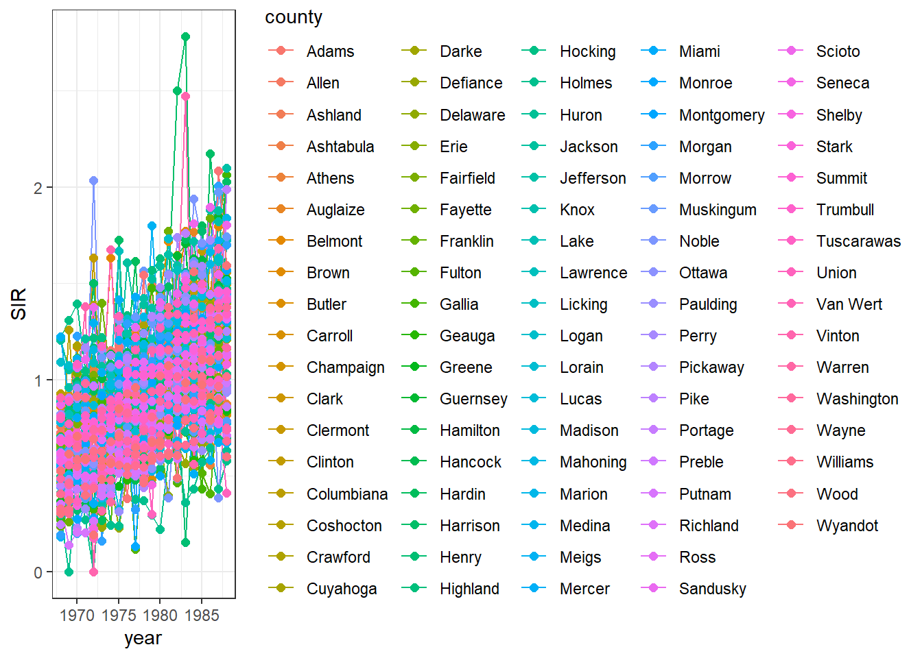
FIGURE 7.3: Time plot of lung cancer SIR in Ohio counties from 1968 to 1988.
We observe that the legend occupies a big part of the plot.
We can delete the legend by adding theme(legend.position = "none") (Figure 7.4).
g <- g + theme(legend.position = "none")
g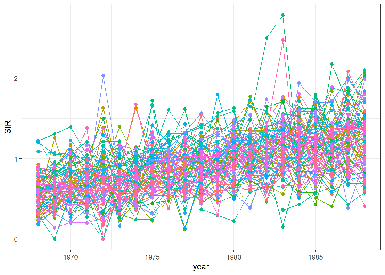
FIGURE 7.4: Time plot of lung cancer SIR in Ohio counties from 1968 to 1988 created without a legend.
We can also highlight the time series
of a specific county to see how this time series compares with the rest.
For example, we can highlight the data of the county called Adams using the function gghighlight() of the gghighlight package (Yutani 2023) (Figure 7.5).
library(gghighlight)
g + gghighlight(county == "Adams")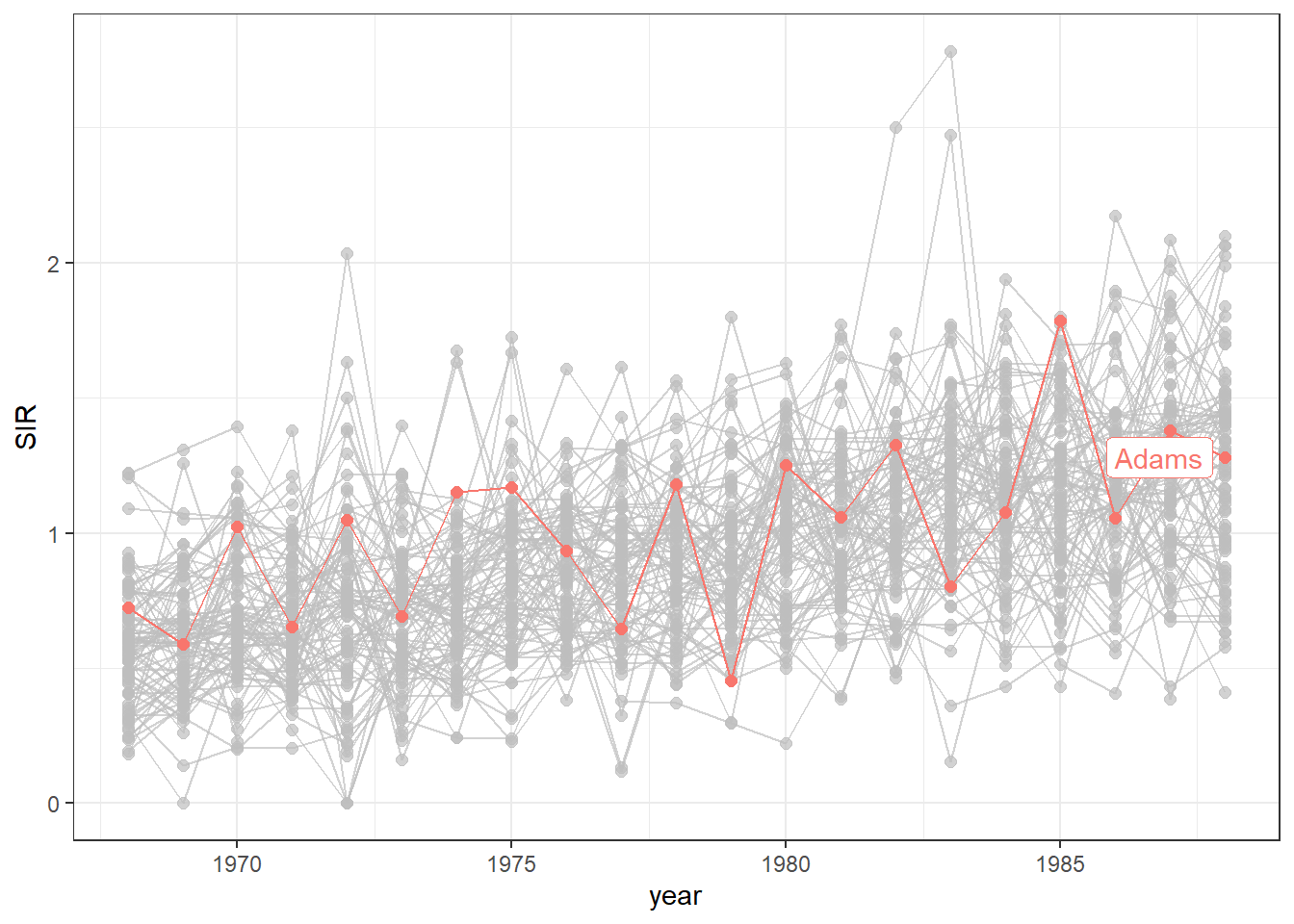
FIGURE 7.5: Time plot of lung cancer SIR in Ohio counties from 1968 to 1988 with the time series of the county called Adams highlighted.
Finally, we can transform the ggplot object into an interactive plot with the plotly package by just passing the object created with ggplot() to the ggplotly() function.
FIGURE 7.6: Interactive time plot of lung cancer SIR in Ohio counties from 1968 to 1988.
The maps and time plots reveal which counties and years have higher or lower occurrence of cases than expected. Specifically, \(\mbox{SIR} = 1\) indicates that the observed cases are equal as the expected cases, and \(\mbox{SIR} >1\) (\(\mbox{SIR} < 1\)) indicates that the observed cases are higher (lower) than the expected cases. SIRs may be misleading and insufficiently reliable for rare diseases and/or areas with small populations. Therefore, it is preferable to obtain disease risk estimates by using model-based approaches which may incorporate covariates and take into account spatial and spatio-temporal correlation. In the next section, we show how obtain model-based disease risk estimates.
7.5 Modeling
Here, we specify a spatio-temporal model and detail the required steps to obtain the disease risk estimates using R-INLA.
7.5.1 Model
We estimate the relative risk of lung cancer for each Ohio county and year using the Bernardinelli model (Bernardinelli et al. 1995). This model assumes that the number of cases \(Y_{ij}\) observed in county \(i\) and year \(j\) are modeled as
\[Y_{ij}\sim Po(E_{ij} \theta_{ij}),\]
where \(Y_{ij}\) is the observed number of cases, \(E_{ij}\) is the expected number of cases, and \(\theta_{ij}\) is the relative risk of county \(i\) and year \(j\). \(\log(\theta_{ij})\) is expressed as a sum of several components including spatial and temporal structures that take into account spatial and spatio-temporal correlation
\[log(\theta_{ij})=\alpha + u_i + v_i + (\beta + \delta_i) \times t_j.\]
Here, \(\alpha\) denotes the intercept, \(u_i+v_i\) is an area random effect, \(\beta\) is a global linear trend effect, and \(\delta_i\) is an interaction between space and time representing the difference between the global trend \(\beta\) and the area specific trend. We model \(u_i\) and \(\delta_i\) with a CAR distribution, and \(v_i\) as independent and identically distributed normal variables. This model allows each of the areas to have its own intercept \(\alpha+u_i+v_i\), and its own linear trend given by \(\beta + \delta_i\).
The relative risk \(\theta_{ij}\) quantifies whether the disease risk in county \(i\) and year \(j\) is higher (\(\theta_{ij}>1\)) or lower (\(\theta_{ij}<1\)) than the average risk in Ohio during the period of study. In next section, we explain how to specify this spatio-temporal model and obtain the relative risk estimates using R-INLA.
7.5.2 Neighborhood matrix
First, we create a neighborhood matrix needed to define the spatial random effect by using the poly2nb() and the nb2INLA() functions of the spdep package (Bivand 2023).
Then we read the file created using the inla.read.graph() function of R-INLA, and store it in the object g which we will later use to specify the spatial structure in the model.
## [[1]]
## [1] 26 55 71 72 80 85
##
## [[2]]
## [1] 19 35 42 70 82 86
##
## [[3]]
## [1]  5  8 16 25 30 59 69
##
## [[4]]
## [1] 14 27 28 34 49 51
##
## [[5]]
## [1]  3 16 29 30 44
##
## [[6]]
## [1] 11 12 83 84
nb2INLA("map.adj", nb)
g <- inla.read.graph(filename = "map.adj")
7.5.3 Inference using INLA
Next, we create the index vectors for the counties and years that will be used to specify the random effects of the model:
-
idareais the vector with the indices of counties and has elements 1 to 88 (number of areas). -
idtimeis the vector with the indices of years and has elements 1 to 21 (number of years).
We also create a second index vector for counties (idarea1) by replicating idarea.
We do this because we need to use the index vector of the areas in two different random effects,
and in R-INLA variables can be associated with an f() function only once.
d$idarea <- as.numeric(as.factor(d$county))
d$idarea1 <- d$idarea
d$idtime <- 1 + d$year - min(d$year)
Now we write the formula of the Bernardinelli model:
\[Y_{ij}\sim Po(E_{ij} \theta_{ij}),\]
\[log(\theta_{ij})=\alpha + u_i + v_i + (\beta + \delta_i) \times t_j.\]
In the formula, the intercept \(\alpha\) is included by default,
f(idarea, model = "bym", graph = g) corresponds to \(u_i+v_i\),
f(idarea1, idtime, model = "iid") is \(\delta_i \times t_j\),
and idtime denotes \(\beta \times t_j\).
Finally, we call inla() specifying the formula, the family, the data, and the expected cases.
We also set control.predictor equal to list(compute = TRUE) to compute the posterior means of the predictors.
7.6 Mapping relative risks
We add the relative risk estimates and the lower and upper limits of the 95% credible intervals to the data frame d.
Summaries of the posteriors of the relative risk are in data frame res$summary.fitted.values.
We assign mean to the relative risk estimates, and 0.025quant and 0.975quant to the lower and upper limits of 95% credible intervals.
d$RR <- res$summary.fitted.values[, "mean"]
d$LL <- res$summary.fitted.values[, "0.025quant"]
d$UL <- res$summary.fitted.values[, "0.975quant"]
To make maps of the relative risks, we first merge map_sf with d so map_sf has columns RR, LL and UL.
Then we can use ggplot() to make maps showing the relative risks and lower and upper limits of 95% credible intervals for each year.
For example, maps of the relative risks can be created as follows (Figure 7.7):
ggplot(map_sf) + geom_sf(aes(fill = RR)) +
  facet_wrap(~year, dir = "h", ncol = 7) +
  ggtitle("RR") + theme_bw() +
  theme(
    axis.text.x = element_blank(),
    axis.text.y = element_blank(),
    axis.ticks = element_blank()
  ) +
  scale_fill_gradient2(
    midpoint = 1, low = "blue", mid = "white", high = "red"
  )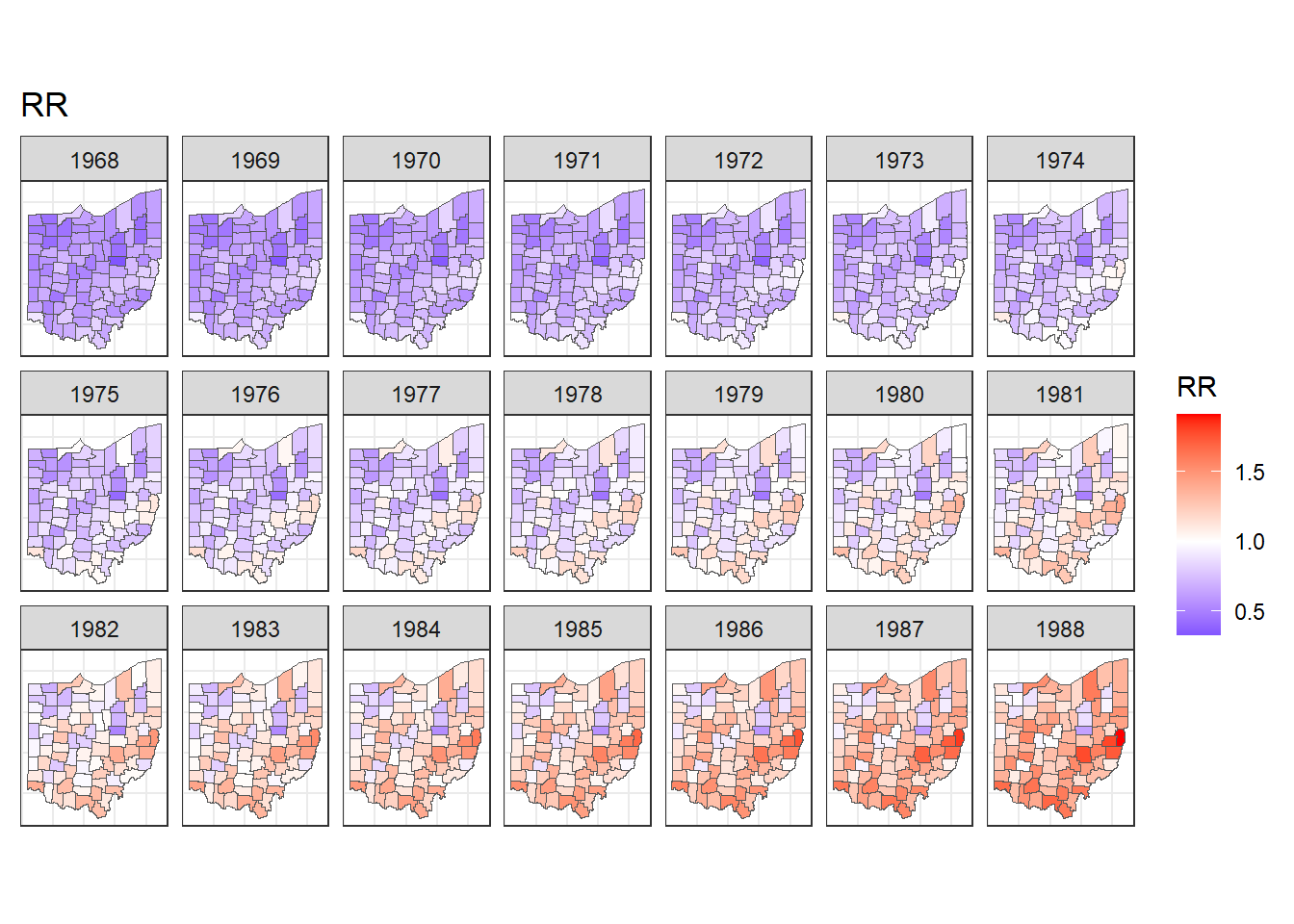
FIGURE 7.7: Maps of lung cancer relative risk in Ohio counties from 1968 to 1988.
Note that in addition to the mean and 95% credible intervals, we can also calculate the probabilities that relative risk exceeds a given threshold value, and this allows to identify counties with unusual elevation of disease risk. Examples about the calculation of exceedance probabilities are shown in Chapters 4, 6 and 9.
We can also create animated maps showing the relative risks for each year using the gganimate package.
To create an animation using this package, we need to write syntax to create a map using ggplot(),
and then add transition_time() or transition_states() to plot the data by the variable year and animate between the different frames. We also need to add a title that indicates the year corresponding to each frame using labs() and syntax of the glue package (Hester and Bryan 2022). For example, we can create an animation showing the relative risks for each of counties and years as follows:
library(gganimate)
ggplot(map_sf) + geom_sf(aes(fill = RR)) +
  theme_bw() +
  theme(
    axis.text.x = element_blank(),
    axis.text.y = element_blank(),
    axis.ticks = element_blank()
  ) +
  scale_fill_gradient2(
    midpoint = 1, low = "blue", mid = "white", high = "red"
  ) +
  transition_time(year) +
  labs(title = "Year: {round(frame_time, 0)}")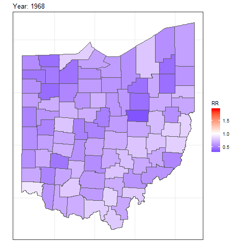
FIGURE 7.8: Animation of lung cancer relative risk in Ohio counties from 1968 to 1988.
To save the animation, we can use the anim_save() function which by default saves a file of type gif.
Other options of gganimate can be seen on the package website.